

Set up app branding
Give your workspace its own name, logo, favicon, brand colors, and link preview card from Settings → Branding.
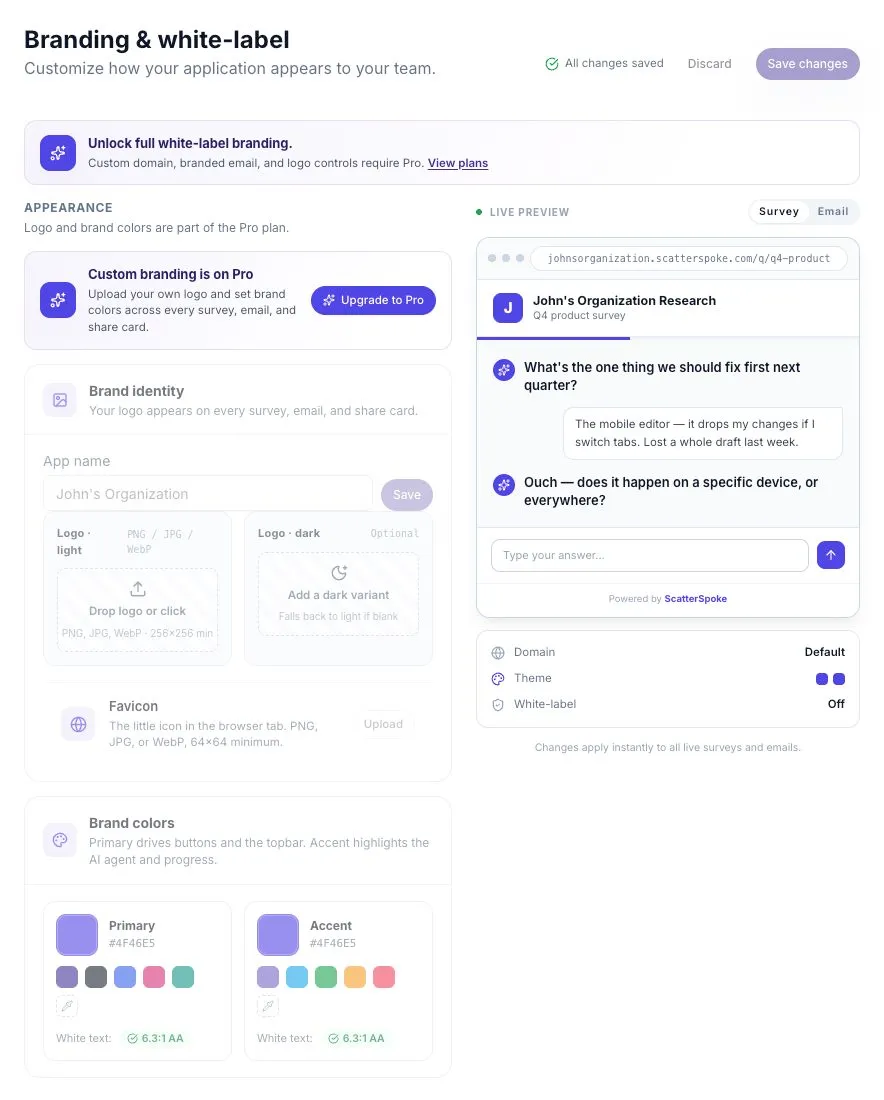
Settings → Branding (“Branding & white-label”) controls how ScatterSpoke looks to your team and to the people answering your surveys. Most appearance settings use Save changes in the page header. App name, domain, and email setup have their own controls.
A live preview sits beside the form and updates as you type, so you can see the effect before saving.
Set the app name
Section titled “Set the app name”Under Brand identity, edit App name and press its own Save button. The name saves separately from the other branding settings.
The app name can have up to 50 characters and defaults to your workspace name. It appears in the app shell, in email, and on the survey page participants see.
Upload logos and a favicon
Section titled “Upload logos and a favicon”Two logo slots sit side by side. Click a slot or drag a file onto it.
| Slot | Used for | Notes |
|---|---|---|
| Logo · light | Light backgrounds — the app shell and previews | The main logo |
| Logo · dark | Dark backgrounds | Optional; falls back to the light logo when blank |
| Favicon | The browser tab icon | Suggested 64×64 minimum |
Every upload must be an image no larger than 5 MB. Logos are rejected above 512×512, favicons above 128×128 — SVGs skip the dimension check. PNG, JPG, and WebP all work.
Check both light and dark previews after uploading so your logo remains readable.
Choose brand colors
Section titled “Choose brand colors”Brand colors has two fields:
- Primary sets the color for buttons and the top bar.
- Accent highlights the AI agent and progress indicators.
Each field offers five presets plus an eyedropper for a custom hex value.
Beside each color is a white-text contrast badge. It reads the ratio of white text on that color and marks it AA at 4.5:1 or better, amber below. Buttons in ScatterSpoke put white text on your primary, so a low badge means your own buttons will be hard to read — pick a darker shade rather than ignoring it.
Edit the social share card
Section titled “Edit the social share card”Social share card controls the preview shown when a survey link is pasted into Slack, X, or iMessage.
- Card title — leave it blank and each survey falls back to its own title.
- Description — enter a short explanation of the survey. Check the default text before sharing: only describe the survey as anonymous if you enabled anonymous collection.
The card renders live as you edit, including your primary color and app initial.
Save or discard
Section titled “Save or discard”The header shows Unsaved changes with an amber dot, or All changes saved with a green check.
- Save changes saves colors, logos, favicon, white-label footer, and social card together.
- Discard rolls every field back to the last saved values.
App name is the exception — it saves on its own button, so discarding will not undo a name change.
What participants see
Section titled “What participants see”The survey page carries your logo, workspace name, colors, and favicon. Open a participant link after saving to check the complete result.
Custom branding is served to participants only while the workspace has paid branding access. Without it the survey page keeps your workspace name but shows the ScatterSpoke mark. See the participant experience.
If a change does not appear
Section titled “If a change does not appear”- Save is disabled: check the plan notice and whether you changed a field.
- The app name changed but the colors did not: the name has its own Save button; save the rest from the page header.
- The logo will not upload: check its file size, format, and dimensions.
- Participants still see ScatterSpoke branding: check your current plan, then reopen the participant link after saving.
Where to go next
Section titled “Where to go next”- White-label branding — what is included and how ScatterSpoke marks appear
- Custom domain — serve surveys from your own subdomain
- Branded email — send invites from your own address