

Read an Ask answer
Understand the charts, tables, quotes, source citations, and tool-use panels that can appear in an Ask answer.
Ask can combine written explanations with visual elements called Ask Artifacts. The elements depend on your question and the available feedback. An answer can contain several, one, or none.
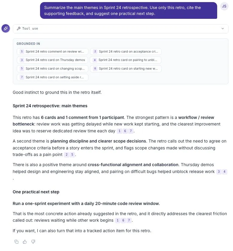
Sources and numbered citations
Section titled “Sources and numbered citations”The Grounded in panel lists the feedback cited in the answer. Numbers in the prose refer to entries in that panel.
Selecting an inline citation moves attention to the matching source. A source with a linked response can open more detail. A source without that detail may only show its label; clicking it does not always open another page.
Use the original source to check a claim. A citation identifies supporting material, but you still need to decide whether the summary represents it fairly.
Charts
Section titled “Charts”Charts can show a change over time, compare categories, or show how a total is divided. Ask supports line, area, bar, pie, and donut charts.
Read the title, axis labels, and time range before interpreting a pattern. A higher bar may mean more responses rather than a larger share of participants. Check what the values measure.
Tables
Section titled “Tables”Tables show comparable details in rows and columns. Select a column heading to sort where sorting is available. An em dash means a value is missing; it does not mean zero.
A table can be useful when you need the exact values behind a comparison rather than a visual overview.
Summary figures
Section titled “Summary figures”A group of summary figures may show a value, a unit, and a change from a previous period. Read the label as well as the number. Check which period and population the comparison covers.
Color is an aid, not the definition of a result. A decrease can be good for waiting time and bad for participation.
Theme bars
Section titled “Theme bars”Theme bars show how often a topic appears in the selected feedback. Look for the sample size or a count such as “5 of 8” alongside the percentage.
One response can mention several themes, so theme percentages do not necessarily add up to 100%. A frequently mentioned topic is worth exploring, but frequency alone does not explain its cause or impact.
Group comparisons
Section titled “Group comparisons”A segments view compares feedback from different groups. It may include number of responsess, sentiment, themes, and supporting quotes.
Compare the sample sizes before drawing a conclusion. A group with a few responses can look very different because of one person’s answer.
Quotes
Section titled “Quotes”A quote shows a specific piece of feedback. Read it in the context of the question that was asked. Do not assume that one quote represents the entire group.
Anonymity and access settings affect which details can be shown. Avoid trying to identify a person from an anonymous example.
Disagreements
Section titled “Disagreements”A Conflict Signal highlights different views on the same topic. It may describe each group’s position and include supporting feedback.
Use it to identify a question for discussion. Different experiences can both be valid; the goal is to understand what differs between them.
Tool use
Section titled “Tool use”The Tool use panel shows the work performed for the answer. Expand it to inspect the listed steps and their status. It can help explain how Ask reached an answer, but it does not replace checking the cited feedback.
Copying and unavailable elements
Section titled “Copying and unavailable elements”The copy button under an answer copies its text, headings, lists, and Markdown tables. Visual artifacts are not included as raw data in that copied text.
If an element cannot render, the surrounding answer can still be readable. Check its sources before using the conclusion, and try a more specific follow-up if necessary.